Rakuten Font

Unique, yet unified
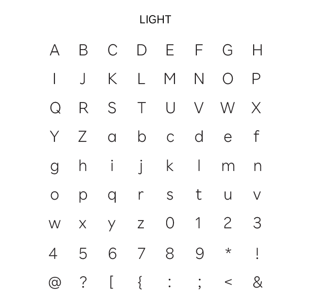
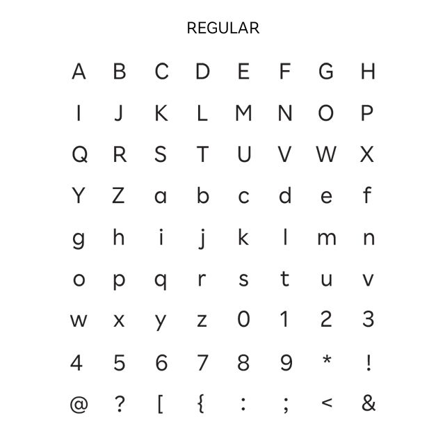
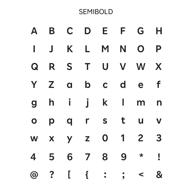
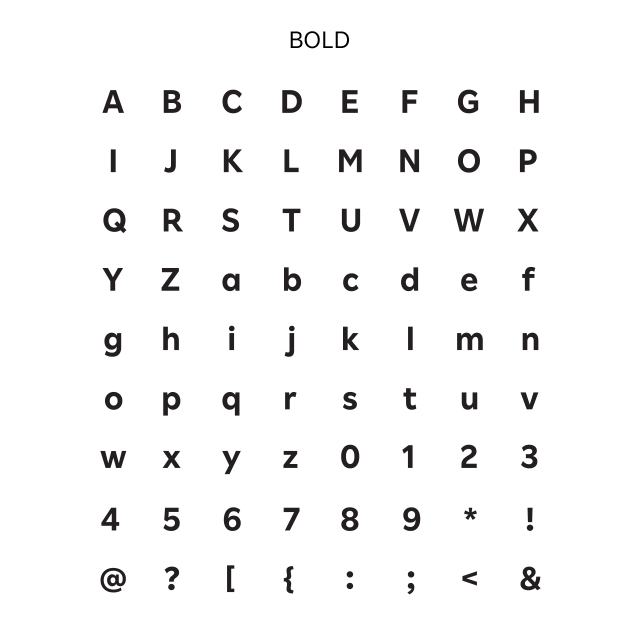
Five font styles to express the unity and diversity of the Rakuten brand
As a global innovation leader offering more than 70 different services, Rakuten communicates a wide range of messages with users and society, leading to increased awareness and value for Rakuten’s brand. We developed this font family to express the uniqueness and diversity of the Rakuten Group and our various services and offerings, while maintaining a sense of consistency with our existing brand assets. Led by the Rakuten Design Lab, under the direction of Rakuten Chief Creative Director Kashiwa Sato, these fonts are designed for use on Rakuten websites, apps and other content.

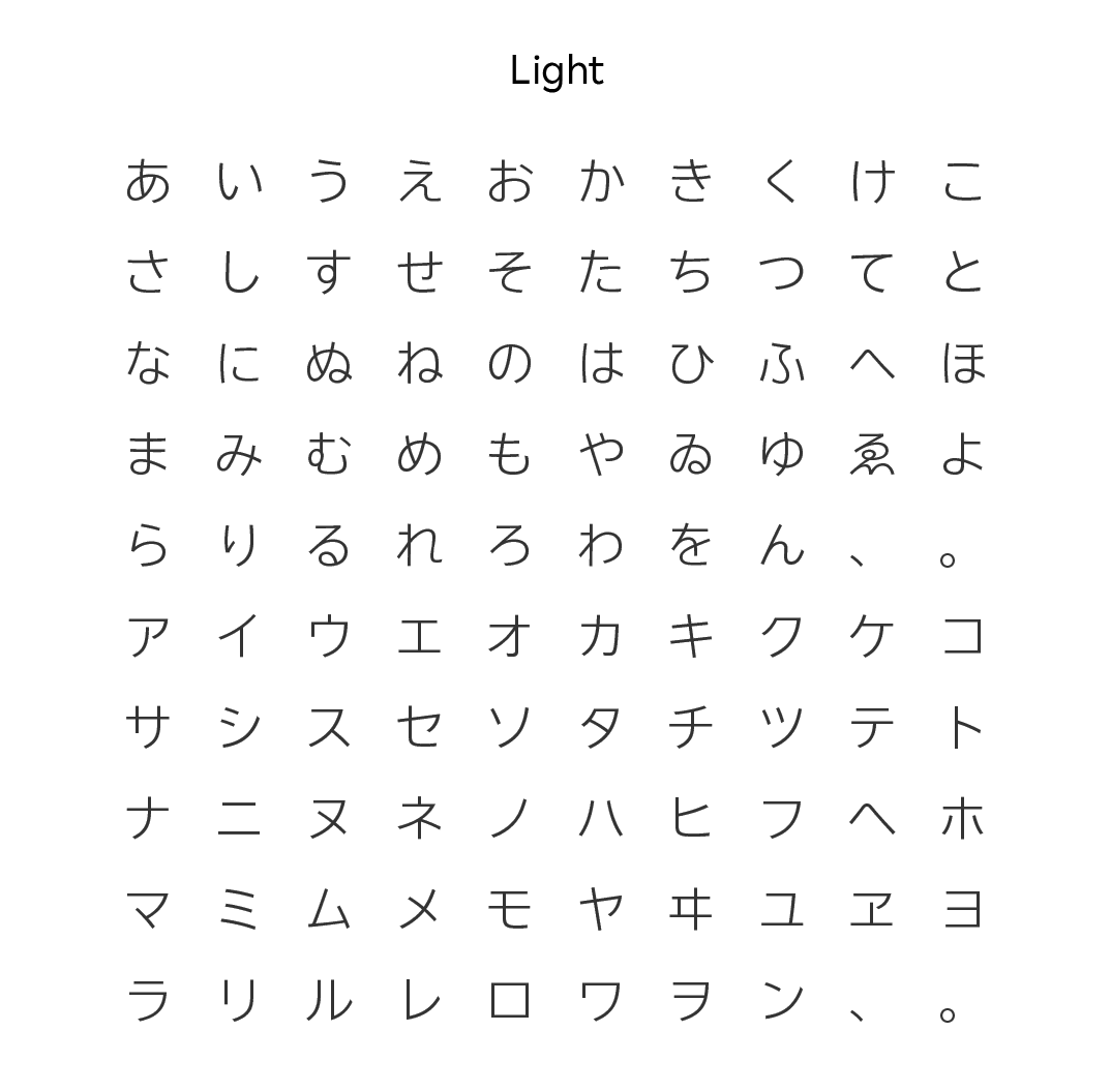
Japanese font “Rakuten Sans JP” embodies Rakuten’s “Tone of Voice”
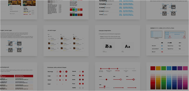
Rakuten has established “Tone of Voice”, which is defined as Optimistic, Embracing Challenges, Warm, Fun, and Honest, to ensure consistent and “Rakuten-like” expression at all touch points. Font design directly affects the impression that letters and texts give. “Rakuten Sans JP” has been designed to express letters that is unique to Rakuten and embody our “Tone of Voice”.
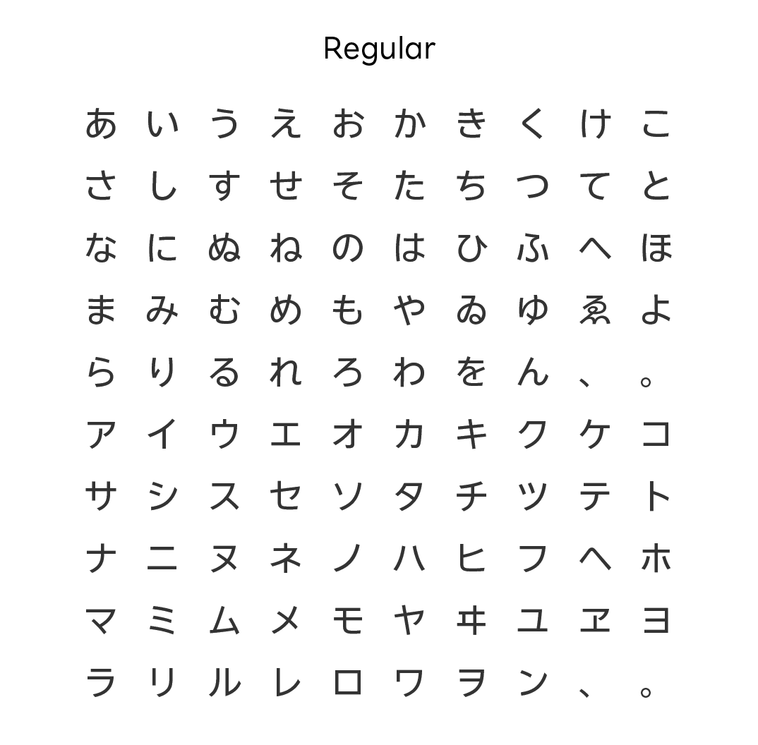
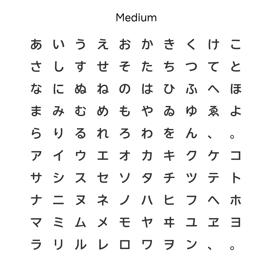
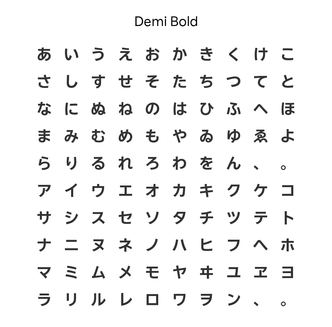
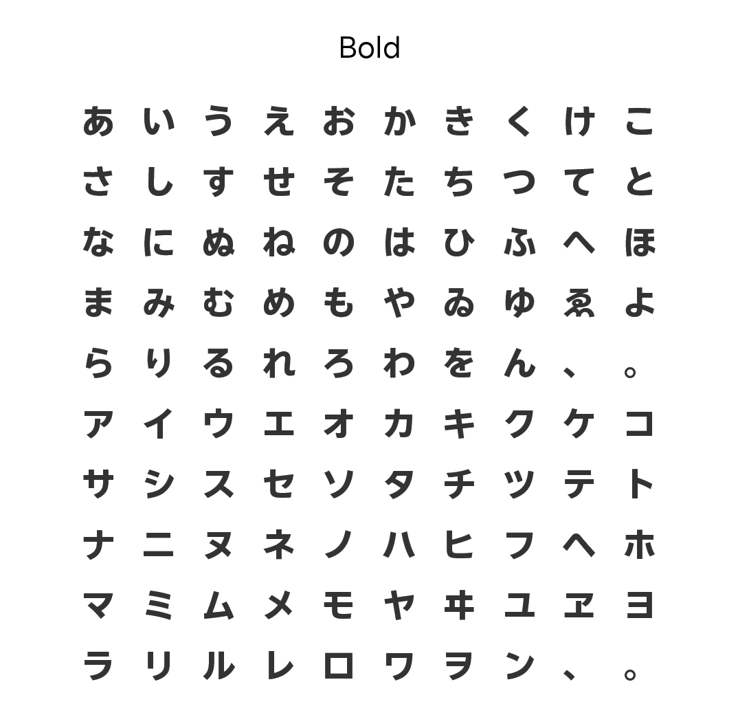
Font Design Created to be Compatible with Latin Fonts and Easy to Read
In developing the Japanese font “Rakuten Sans JP”, consideration was given to compatibility with the previously released Latin font. The development concept and design details were especially inherited from the Latin sans serif font “Rakuten Sans” to create a unified design. In addition, the font was designed to be easy to read at various touch points, regardless of the font size and online/offline media.

Based on geometric proportions, the concept of “Rakuten Sans” is inherited with wide counters and sharply angled edges.
Latin Fonts with different voices, inspired by the form of the Rakuten logo
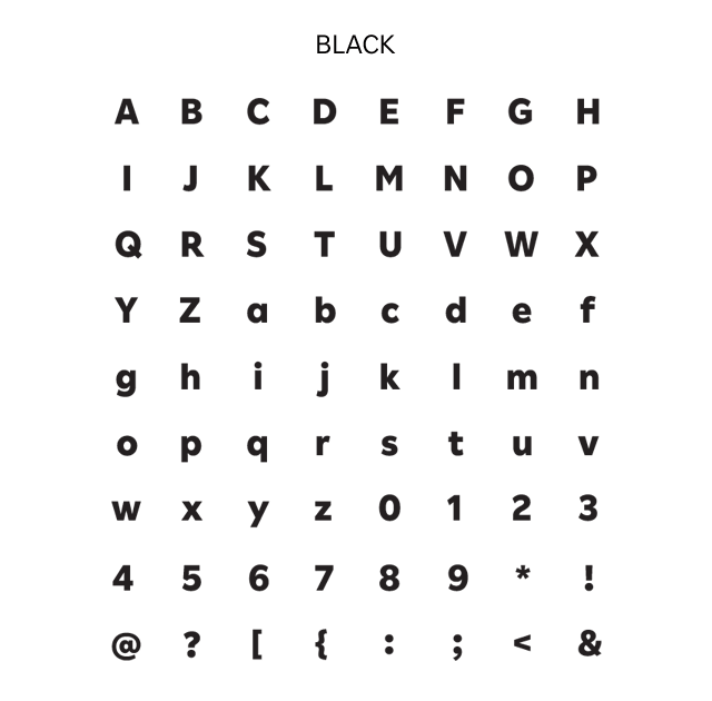
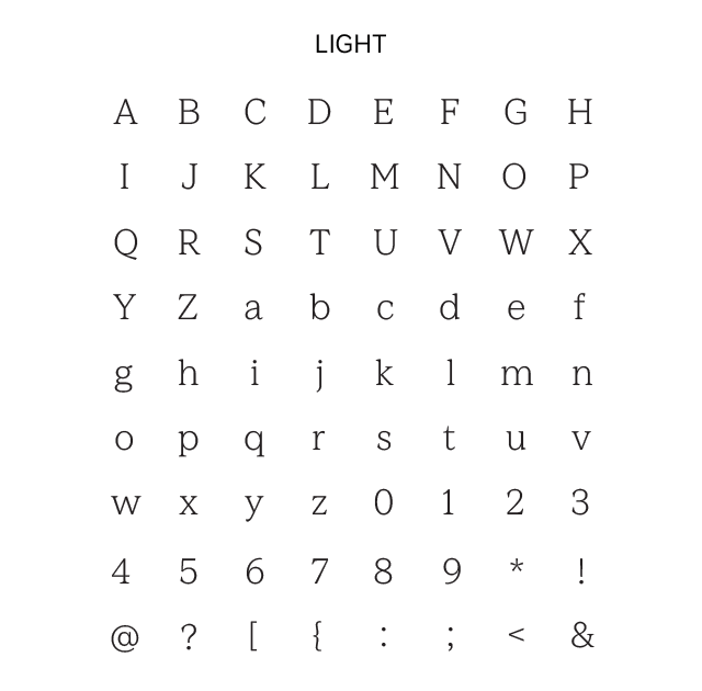
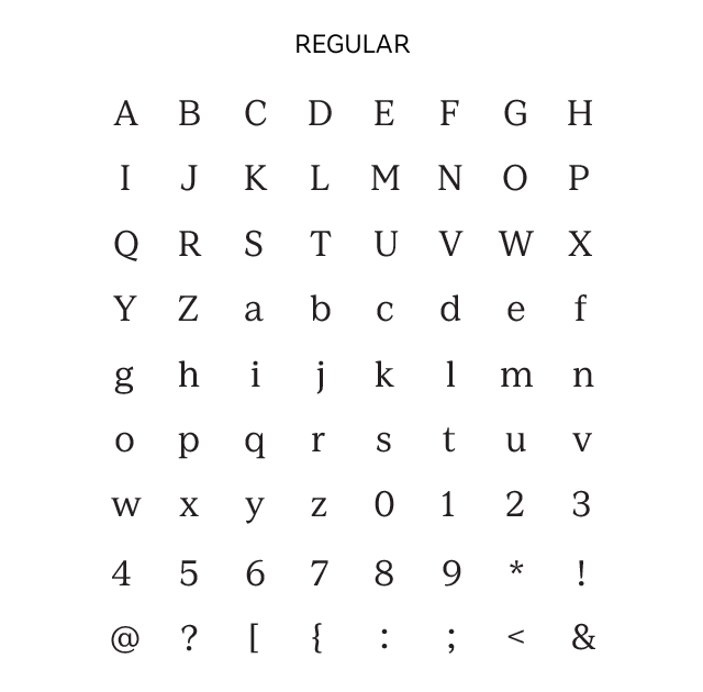
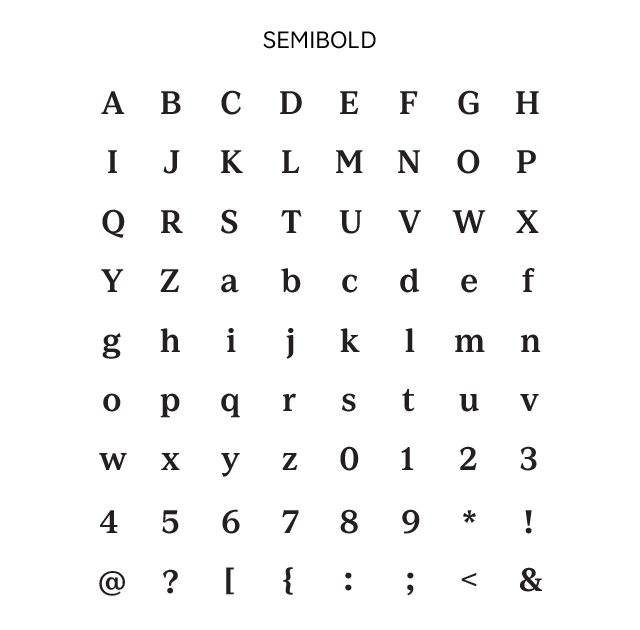
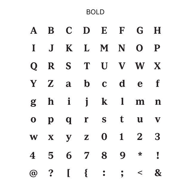
We created four font styles, each with a distinct personality, based on the form of the Rakuten logo: Sans as the welcoming and accessible default, Serif for expressing elegance, Rounded for a fun and playful approach, and Condensed for a bold, impactful impression. This diverse range of options allows us to select the fonts best suited to our message, opening avenues for more effective communication.


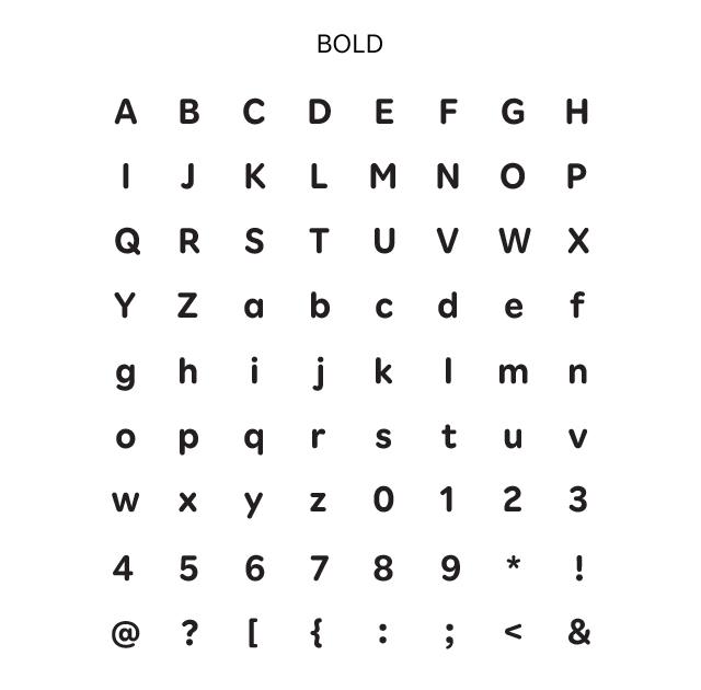

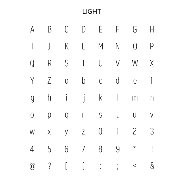
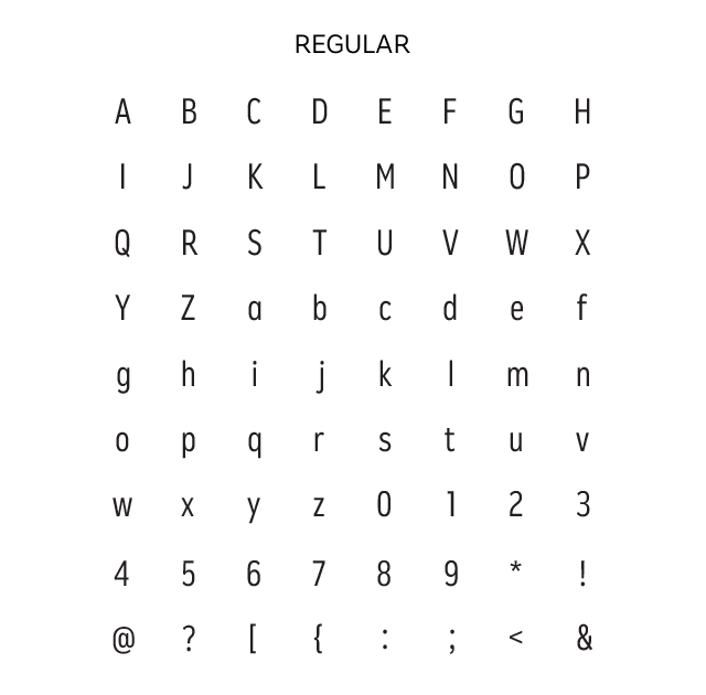

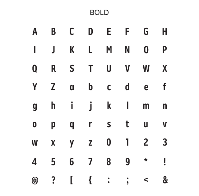
Easy-to-read fonts, suitable for all purposes
These fonts were designed to maximize legibility and readability. One issue that often accompanies smaller font sizes is that an "a" becomes almost indistinguishable from an “o”.
Rakuten Sans resolves this readability issue by creating two alternate glyphs for “a” and “g” that can be used interchangeably as appropriate. The designers also carefully considered the height of lower case letters relative to upper case ones, taking into account various use cases, to craft optimal forms for a wide range of settings, such as websites, apps and printed materials.


The single and double-story letter “a” and “g” in Rakuten Sans
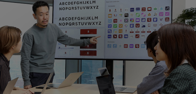
From London to Tokyo, a collaboration with typeface design studio Dalton Maag
Rakuten invited Dalton Maag, a London-based typeface design studio that has helped produce the corporate fonts of many iconic brands, to collaborate in the creation of these new fonts. Through workshops and discussions with our designers and brand managers, our teams were able to reach an in-depth and shared understanding of the Rakuten brand, set clear goals and create four font styles that capture the unique essence of Rakuten.
See below for a video of the fireside chat between Rakuten Chief Creative Director Kashiwa Sato, who oversaw the project, and Dalton Maag Chairman Bruno Maag.